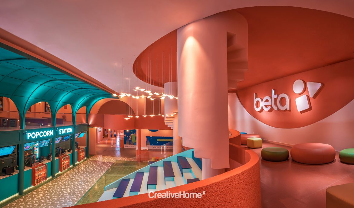
At Beta Cinemas in Quang Trung, Ho Chi Minh City, trendy tones ranging from pink, bright reds and oranges to shades of blues and greens envelope the senses in an impressive manner. According to Vietnamese design firm Module K, an urban art style approach was employed for the cinema design to resonate with the dynamic and bustling Saigon city vibe.
“Every detail of the cinema’s construction integrates the architectural features of Saigon through colourful and brilliant prisms,” the designers say. “We wanted to capture the iconic features of Saigon and transform them by stripping away details, condensing the basic lines, and turning them into geometric shapes.”


The design is, without doubt, a magnificent creative feat, and upon further exploration of the space, each of the key spaces takes inspiration from Saigon’s architectural marvels.
From the main entrance, alternating geometric shapes instantly key the cinema’s breathtaking visual effect. At the reception desk, a dome-like element in Indochinese green is reminiscent of the ceiling at the Saigon Central Post Office, while an adjacent circular staircase in bright blue with decorative pigeons takes cue from the Saigon Notre-Dame Cathedral and Saigon Municipal Opera House.


The large hallway leading into the main cinema halls feature colour-changing arches complemented by asymmetrical arch pillars in flamingo pink – similar to Tan Dinh Church’s design. The mezzanine and ground floor are connected via corridors to ensure visual continuity. Several semicircular loggias are turned into check-in corners while offering panoramic views of the space.


Colours take centre stage to bring out the design, resulting in a colour-blocking aesthetic where each block of colour is in harmony with one another. “We used the technique of “solid” colour treatment, akin to how graphic design is applied within an interior architectural space in order to bring a special element to the project. The main colour gamut of cool green and bright orange along with the details of the dome consolidate the space with a touch of unity,” the designers elaborate. “The overall space is made out of independent coloured blocks and cubes, with their own meaning but connected, thanks to the balanced structure. Through using stretches of colour, the space appears limitless.”


